Alpha Channel devlog via archaeology
Posted on Wednesday, 25th August 2010
Since this was my first Ludum Dare, making the game Alpha Channel, I didn’t make an effort to post my progress as it happened. However, through the magic of git, I’ve pulled some old versions up and seen how things developed. Interesting to see how the game progressed and if you have git you could also look at the progress made throughout the development via the repository at github.com (if you were very bored, of course).
I’m using my local time, not that of the competition, in the entries.
Day 1, 8:46 am: Created the project
The competition had started too late the night before (3 am my time), so I didn’t stay up. I got up early to eagerly discover the theme and was really happy that it was one of those I’d voted up because it sounded potentially inspirational for a game (the more vague themes were not as interesting to me).
I can’t think of a name, so spooner_ld_18 becomes the working title. I have several ideas at this point and bounce them around my friends, but soon decide that I want to:
- Use Gosu/Chingu libraries on Ruby. I’d used these a bit for another long-term project I’d started, but that was more GUI-based than real-time.
- Pixellised (partially from style, but mainly to allow me to rapidly create graphics that didn’t look terrible).
- Not a platform game (just too many of them about).
- I wouldn’t actually start coding for a few hours, until I’d formulated a bit of a plan. I decided to make a game where you played a wizard who was being attacked by monsters, but who could somehow control those monsters in order to survive. Although the game-play didn’t change much from this initial blueprint, the concept would actually change to fit the initial “placeholder” graphics!
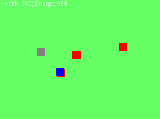
Day 1, 2:00 pm: First “playable” version
The sprites would be 8×8 and zoomed out, so 1 game pixel would cover 4×4 screen pixels, but I decided to use simple blocks for prototyping; I’d be able to draw the sprites properly later…(but never would :$).
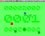
The “monsters” were red blocks, which they stayed throughout the whole development. The wizard was white, turning grey when he was controlling a monster. A controlled monster was blue and sprites could still overlap each other, which didn’t look terrible in this “blocky” version, but I knew would be terrible when the sprites were actually drawn. I was showing health and energy (the time you could keep control of a monster) in numbers at top of the screen, but this was pretty impossible to keep track of while playing. I was, at this time, planning to replace the health/energy numbers with bars later on. The screen was initially green, to represent grass, not a computer screen!
Day 1, 3:00 pm: Sound effects
The first sound effects were added at this point, being created in sfxr. The main impetus for this was wanting aural feedback for taking damage. I didn’t spend a long time on this, but I felt I’d got the sounds pretty right within a short space of time. As it happened, I got some grief from people playing my game in the end, because the sound effects were too loud, mainly because I was being quite slack in how I played them (every Pixel contact generated a separate sound, so if lots of objects were touching, the sound got quite loud).
Day 1, 4:00 pm: Bad pixels
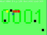
Because levels were a bit flat, I decided to add randomly placed obstacles, originally called Bad Pixels. They’d be something to hide behind and to avoid since they would slowly damage any Pixel pushing against them. This was also the point at which I prevented the red Pixels from overlapping. This was also the first time I considered my game objects to be Pixels, rather than wizards and monsters, I think.
Day 1, 8:00 pm: Transparency is life itself
Again striving for feedback in the game, I set the alpha channel of each Pixel proportional to its current health. This made the health shown at the top of the screen irrelevant and since I had already put the large level (0001) indication in the background of the game, I was just about to move the score into the background as well. Energy would soon be indicated by the blue colour channel mainly so I could remove all those numbers on the status line.
Also the first point that I drew a link between player and controlled enemy, which was to be a place-holder for some sort of fancy electricity or particle effect, but which I never actually got around to improving upon.
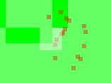
Day 1, 10:15 pm: Exploding on death
Added some particle effects that made it look like the Pixel was breaking into 16 pieces that shot off in different directions. The sound effect had been there for a while, but I thought it would be nice to add an effect for this rather than just have things disappear. Unlike the rest of the visual and aural effects I added, this was more aesthetic than for improving the feedback given to the player.
At this point, the player had a lot more health and could pretty much barge through the levels without actually using the enemy-controlling effect! I had to tone this down later, since it made the main point of the level pointless and the game pretty easy once you realised.
Day 2, 1:30 pm: Particle effects on contact
To make it much more clear where contacts were being made, and therefore where damage was being done, I added some simple particles along the edges of contact. Half of the particles would be created in the colour of one contactee; the other half the other colour. Again, this was added because it needed to be added for player feedback, rather than as a flashy effect in itself.
Day 2, 2:14 pm: Finally decided on a name
Struggling with a name, I’d come up with “Pixhell”, but then found that name was already used by other things. I wondered what was the most important thing to the Pixels characters in my game and that was the alpha channel (this respresents health; Pixels fade out before finally dying in a shower of particles). So…”Alpha Channel”. Not going to win any awards for great titles, but I feel it fits the game well.
Day 2, 5:01 pm: Added a high score system
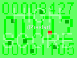
I considered adding an online high score system, since the framework for one was available in one of the libraries I was using. In the end I chickened out, since I felt that such a system would be very likely to fail as well as taking a unnecessarily long time to implement and test). In the end, I just showed the current high score at the bottom of the screen and the current score at the top, the player’s best score just being stored in a local text file. I think that implementing the online high score system was the thing I really missed out on. My friend ippa’s game used it, and I think it did encourage some players to play it more so they could beat each other. Probably the first thing I’d add if I was continuing development…
Day 2, 11:30 pm: v1.0 (Windows only) - Three and a half hours within the time limit (well, that was when I committed the final version; my actual upload was a bit later).
Finally finished, though I’d barely changed anything in the evening, since I was just play-testing it and tweaking numbers here and there to correct the balance. I tweaked the difficulty as the levels progressed and replaced the font with one that was more boxy, since that was more in-keeping with the game’s aesthetic. Watch a game-play video of this iteration at youtube.com.
Day 4 (after event): v1.1 – Entry ported to Linux and OS/X
Unfortunately, the very boxy font I’d chosen for the initial release, which worked fine on Windows, was so badly displayed in Linux (only the top half of the characters were actually shown) that I need to pick a new font that was consistent across all three platforms. The first font I’d used didn’t display as I wanted it to on OS/X, which is one of the reasons I’d replaced it originally, so I ended up with this one. I don’t like it as much, but it is still mostly in keeping with the overall style and ensures that all 3 OS versions look identical.
